The Style Tab gives you complete control over the visual appearance of your feedback widget. Customize colors, spacing, sizes, and more without writing any code.
Accessing Style Tab #
- Go to WordPress Admin → Was This Helpful
- Click the “Style” tab at the top
- All visual customization options are here
Spacing & Layout Settings #
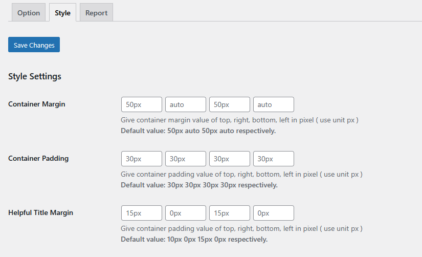
Container Margin #
Default: 50px auto 50px auto (Top, Right, Bottom, Left)
What it does: Controls the space OUTSIDE the feedback widget container.
How to use:
- First value (50px): Space above the widget
- Second value (auto): Right side (auto centers it)
- Third value (50px): Space below the widget
- Fourth value (auto): Left side (auto centers it)
Examples:
More space above and below:
80px auto 80px auto

Remove all margin:
0px auto 0px auto

Only top margin:
30px auto 0px auto
When to adjust:
- Widget too close to content → Increase top/bottom values
- Widget not centered → Keep “auto” for left/right
- Too much white space → Decrease values
Container Padding #
Default: 30px 30px 30px 30px (Top, Right, Bottom, Left)
What it does: Controls the space INSIDE the feedback widget container (between the border and content).
Examples:
More spacious feel:
40px 40px 40px 40px

Compact design:
15px 15px 15px 15px

Asymmetric padding:
30px 50px 30px 50px
Visual difference:
Small padding (15px):
┌──────────────┐
│Was helpful?  │
│ [Yes] [No]   │
└──────────────┘

Large padding (50px):
┌────────────────────┐
│                    │
│  Was helpful?      │
│  [Yes]    [No]     │
│                    │
└────────────────────┘
Helpful Title Margin #
Default: 15px 0px 20px 0px (Top, Right, Bottom, Left)
What it does: Controls spacing around the question text (“Was this helpful?”).
Common adjustments:
More space below question:
15px 0px 30px 0px

Tight spacing:
10px 0px 10px 0px

No spacing:
0px 0px 0px 0px
Button Dimensions #
Feedback Button Width #
Default: 110px
What it does: Sets the width of Yes/No feedback buttons.
Recommended ranges:
- Narrow: 80px-100px (for short text like “Yes”/”No”)
- Standard: 110px-130px (default, works for most cases)
- Wide: 140px-200px (for longer text like “Very Helpful”)
Examples:
Short buttons: 90px
[Yes] [No]

Long buttons: 150px
[  Helpful  ] [  Not Helpful  ]
Tips:
- Match button width to your text length
- Wider buttons = easier to tap on mobile
- Keep both buttons the same width
Feedback Button Height #
Default: 54px
What it does: Sets the height of Yes/No feedback buttons.
Recommended ranges:
- Compact: 40px-45px
- Standard: 50px-60px (default)
- Large: 65px-80px (better for mobile)
Accessibility tip: Larger buttons (minimum 44px height) are easier to tap on mobile devices.
Submit Button Width #
Default: 110px
What it does: Width of the “Submit” button that appears after users want to leave comments.
Note: Usually matches Feedback Button Width for consistency.
Submit Button Height #
Default: 54px
What it does: Height of the “Submit” button.
Note: Usually matches Feedback Button Height for consistency.
Submit Button Font Size #
Default: 16px
What it does: Text size on the Submit button.
Recommended ranges:
- Small: 12px-14px
- Standard: 15px-16px
- Large: 17px-20px
Color Customization #
Container Background Color #
Default: #FFFFFF (White)
What it does: Background color of the entire feedback widget container.
Popular choices:
#FFFFFF– White (clean, minimal)#F9FAFB– Light gray (subtle)#F0F9FF– Light blue (modern)#FEF3C7– Light yellow (attention-grabbing)
Design tips:
- Should contrast with your site background
- Light colors work best for readability
- Match your site's color scheme
Container Border Color #
Default: #E5E7EB (Light gray)
What it does: Color of the border around the feedback widget.
Popular choices:
#E5E7EB– Light gray (subtle)#D1D5DB– Medium gray (visible)#3B82F6– Blue (modern)#10B981– Green (positive)
Tips:
- Use subtle colors for borders
- Can match your primary brand color
- Darker borders create more definition
Positive Button Background #
Default: #3DD396 (Turquoise/Green)
What it does: Background color of the “Yes”/”Helpful” button.
Best practices:
- Use green or blue (positive colors)
- Should clearly differ from negative button
- Ensure good contrast with button text
Recommended colors:
#10B981– Emerald green#3DD396– Turquoise (default)#3B82F6– Bright blue#8B5CF6– Purple (modern)
Positive Button Border #
Default: #3DD396 (Same as background)
What it does: Border color of the positive button.
Common approaches:
- Match background (default):
#3DD396- Clean, modern look
- Darker shade:
#2CA67C- Adds subtle definition
- No border:
transparent- Flat design style
Negative Button Background #
Default: #FB7185 (Coral/Red)
What it does: Background color of the “No”/”Not Helpful” button.
Best practices:
- Use red, orange, or coral (negative/warning colors)
- Should clearly differ from positive button
- Not too aggressive (avoid bright red)
Recommended colors:
#FB7185– Coral (default, softer)#EF4444– Red (clear negative)#F59E0B– Orange (constructive)#64748B– Gray (neutral)
Negative Button Border #
Default: #FB7185 (Same as background)
What it does: Border color of the negative button.
Common approaches:
- Match background for clean look
- Slightly darker for definition
- Transparent for flat design
Text Button Color #
Default: #FFFFFF (White)
What it does: Color of text on both Yes/No buttons.
Best practices:
- White (#FFFFFF) works with most dark/vibrant buttons
- Dark (#1F2937) works with light colored buttons
- Ensure strong contrast for accessibility
Contrast check:
- White on green ✅
- White on yellow ❌ (poor contrast)
- Dark on yellow ✅
Feedback Text Color #
Default: #6B7280 (Gray)
What it does: Color of text in messages and prompts.
Recommended colors:
#6B7280– Medium gray (default, readable)#4B5563– Darker gray (stronger)#374151– Near black (high contrast)
Feedback Inner Text Color #
Default: #374151 (Dark gray)
What it does: Color of text inside the feedback form/comment box area.
Note: Usually slightly darker than regular feedback text for emphasis.
Feedback Box Background #
Default: #F9FAFB (Very light gray)
What it does: Background color of the comment input box.
Popular choices:
#F9FAFB– Very light gray (subtle)#FFFFFF– White (clean)#F0F9FF– Light blue (modern)
Feedback Box Border #
Default: #E5E7EB (Light gray)
What it does: Border color around the comment input box.
Tips:
- Should be visible but not distracting
- Can match container border
- Subtle colors work best
Submit Button Text #
Default: #FFFFFF (White)
What it does: Text color on the Submit button.
Note: Usually white for visibility on colored buttons.
Submit Button Background #
Default: #3DD396 (Turquoise/Green)
What it does: Background color of the Submit button.
Best practices:
- Often matches Positive Button color
- Or uses your primary brand color
- Should stand out from the form
Submit Button Border #
Default: #3DD396 (Same as background)
What it does: Border color of the Submit button.
Custom CSS #
Helpful Custom CSS #
What it does: Allows you to add custom CSS code for advanced styling.
When to use:
- Want styling not available in options
- Need hover effects
- Want to override specific styles
- Advanced customization
Example custom CSS:
/* Add shadow to feedback widget */
.feedback-container {
    box-shadow: 0 4px 6px rgba(0, 0, 0, 0.1);
}

/* Rounded button corners */
.feedback-button {
    border-radius: 25px;
}

/* Hover effect on buttons */
.feedback-button:hover {
    transform: scale(1.05);
    transition: all 0.3s;
}

/* Change font family */
.feedback-container {
    font-family: 'Arial', sans-serif;
}

/* Center align all text */
.feedback-container {
    text-align: center;
}
Common customizations:
- Button hover effects:
.positive-button:hover {
    background-color: #2CA67C !important;
}
- Add transitions:
.feedback-button {
    transition: all 0.3s ease;
}
- Custom borders:
.feedback-container {
    border: 2px solid #3B82F6;
    border-radius: 10px;
}
Pre-Made Color Schemes #
Scheme 1: Modern Blue & Green #
Positive Button: #3B82F6 (Blue)
Negative Button: #EF4444 (Red)
Container Background: #F0F9FF (Light Blue)
Text: #1E40AF (Dark Blue)
Scheme 2: Elegant Gray #
Positive Button: #10B981 (Green)
Negative Button: #64748B (Gray)
Container Background: #F9FAFB (Light Gray)
Text: #374151 (Dark Gray)
Scheme 3: Vibrant & Friendly #
Positive Button: #8B5CF6 (Purple)
Negative Button: #F59E0B (Orange)
Container Background: #FFFFFF (White)
Text: #6B7280 (Gray)
Scheme 4: Minimal Dark #
Positive Button: #10B981 (Green)
Negative Button: #6B7280 (Gray)
Container Background: #1F2937 (Dark)
Text: #F9FAFB (Light)
Saving Your Changes #
- Make your styling changes
- Click “Save Changes” button
- Clear your browser cache if needed
- View your site to see the changes
Testing Your Design #
After saving:
- Desktop view: Check on regular browser
- Mobile view: Use Chrome DevTools or actual mobile device
- Different browsers: Test in Chrome, Firefox, Safari
- Dark mode: If your site supports it, test in both modes
Mobile Responsiveness Tips #
The plugin is responsive by default, but here are tips:
- Use button heights of at least 50px for easy tapping
- Keep text readable (minimum 14px font size)
- Test on actual mobile devices
- Ensure buttons don't overlap on small screens
Accessibility Best Practices #
- High contrast: Ensure text is readable (WCAG AA standard)
- Large tap targets: Buttons at least 44px tall
- Clear labels: Descriptive button text
- Focus states: Buttons should have visible focus for keyboard users
Check contrast: Use WebAIM Contrast Checker
Common Styling Questions #
Q: Changes not showing? A: Clear browser cache and reload the page.
Q: Can I have different colors per post? A: Not through settings, but possible with custom CSS and post classes.
Q: How do I make buttons round? A: Add to Custom CSS: .feedback-button { border-radius: 50px; }
Q: Can I change font? A: Yes, in Custom CSS: .feedback-container { font-family: 'Your Font'; }
Related Guides #
- Options Tab Settings – Configure functionality
- Troubleshooting Styling – Fix common issues
Need help? Contact support through our support channel: Contact us


 OFF every WordPress plugin!